
UI Design Principles and Best Practices of Dark User Interface

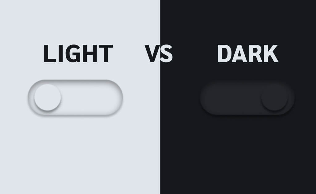
Dark UI Design: Do, or Don’t?
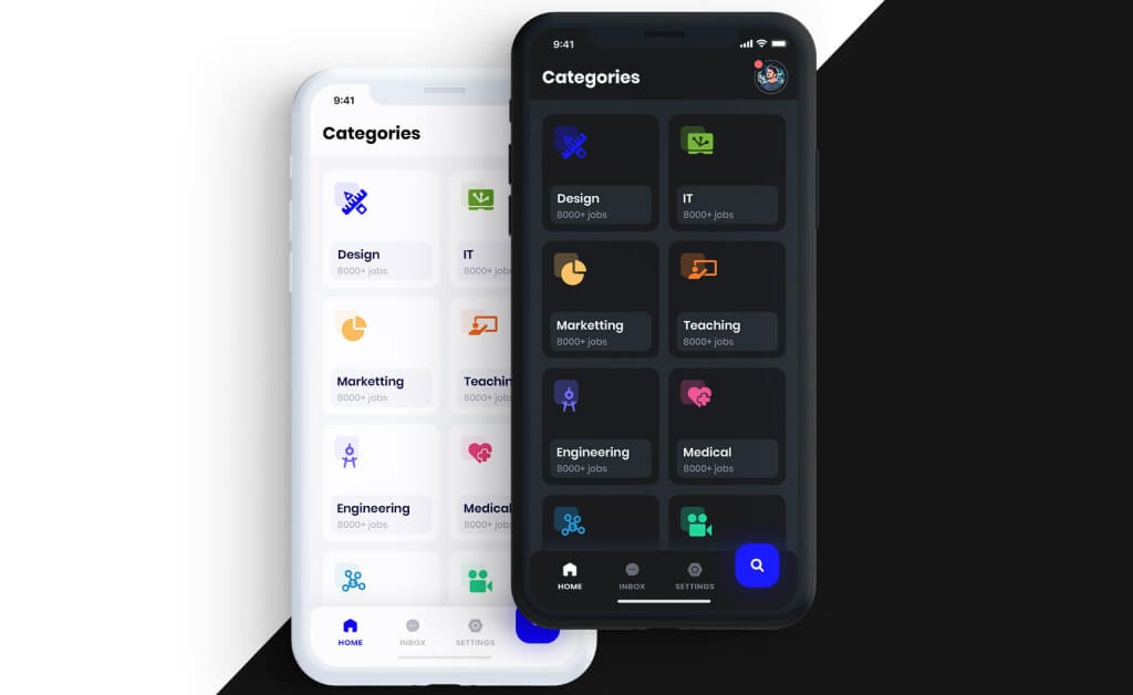
Implementing dark backgrounds and patterns in web, mobile and software applications continues to gain popularity. So, when asked whether a light-based user interface (UI) or a darker one is better, there is no simple answer. There are however several considerations that can help you make the right choice between a dark UI and a light UI.
What is UI Design?
Before diving into the advantages and disadvantages of dark website design and light website design, let’s first have a look at the definition of user interface (UI) and user interface design (UI design services).
What is UI? User interfaces are the access points where users interact with designs. Depending on the software application, a user interface can be either graphical, voice-controlled, or gesture-based. A computer is considered to be a graphical user interface (GUI) whereas smart assistants like Siri or Alexa are considered voice-controlled interfaces (VUIs). When users engage with 3D designs through bodily motions, we talk about gesture-based interfaces (GBIs.) Virtual reality games are an example of a GBI.
What is UI Design? The user interface design of a software application is what the user sees and interacts with on the screen. The UI design shapes not only what the user will see, but equally important, how the user will interact with the design of a product as part of the overall design experience.
That said, the user interface (UI) should not be confused with user experience (UX) which covers all aspects of the end-user’s interaction with a company, its web presence, mobile applications, or software systems.
Read ‘What is UI Design and Why Is It Important?’ to learn more about the importance of user interface design and current trends.
How to Choose between Light UI and Dark UI?
Making the decision between using a light vs dark color for your user interface should be more than just a personal preference.
Users
Knowing your potential user and understanding their needs and preferences should always be a first step in designing UI for your website, app, or software products. Will they use their user interface mostly during the daytime or during evening hours? Does your product contain a lot of text, or will it be minimalistic?
Branding
A brand's style is the look and feel behind the brand's aesthetic. If a brand is known to use bright colors to engage with its audiences, shifting to a dark user interface could be confusing. Your brand has to be instantly recognizable, and since colors are linked to memory, having a signature color palette will help you to create a consistent identity.A brand's style is the look and feel behind the brand's aesthetic. If a brand is known to use bright colors to engage with its audiences, shifting to a dark user interface could be confusing. Your brand has to be instantly recognizable, and since colors are linked to memory, having a signature color palette will help you to create a consistent identity.
Purpose
The purpose of your site, app, or software product plays an important role when it comes to your UI design. Who do you expect to interact with your user interface? What do you want your audience to be able to do? Understanding the effect that colors have on your audience, and choosing one that is in line with the purpose of your product or service is a must.
When using a light theme website, you will need dark, saturated fonts, colors, and style elements. If you’re going with a dark theme website, you will need to implement light, unsaturated fonts, colors, and style elements. This is a general rule that applies not only to websites but mobile applications and software products as well.
If you need professional help with your website, app, or software design, Pixel506 can help. Read more about our UI design services, or contact us for a personal consultation.
Dark UI Design Best Practices
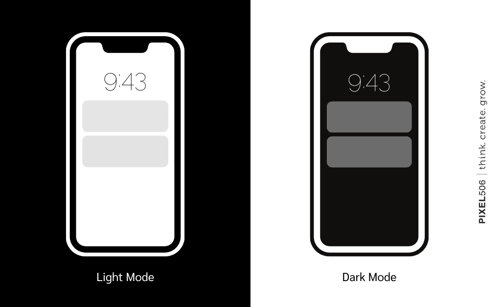
A strong contrast between dark and light helps users to guide through an interface and will assist those with vision issues. Let’s take a look at some best practices of how to use the dark background UI design trend on a website, mobile, or software product.
Uber’s mobile app switches to night-mode to make the display easier on your eyes.
While Uber’s user interface is light during the day, it automatically switches to a dark mode in the evening which makes it easier for the driver to see in the darkness and is less hard on the eyes for both drivers and riders.
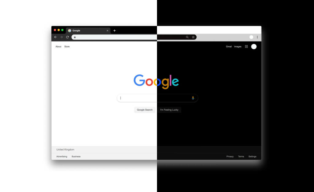 A dark UI background on the Google.com website.
Although Google’s user interface is known for its bright design and simplicity, Google dark mode for Search is available for desktop users.

A dark UI interface on the software product Netflix.
For its logo and user interface, Netflix uses a dark background with reddish lighting which is appealing to consumers who are used to watching their movies and shows in the evening or at night.
These are just three practices that demonstrate that a dark user interface can be aesthetically pleasing and possibly a good option to alternate with a lighter interface after sunset. Without much effort, you can easily find other examples or black and white (eCommerce) websites that might either inspire you or dissuade you from using a dark UI design.
5 Reasons to Use Dark UI Design
There are situations in which a dark user interface is recommended.
- When your brand’s color scheme is dark, your user interface should be as well. Your digital presence should match your brand's look and feel.
- When your brand has a clean and minimalistic look, when you want a core element to stand out, or when you want to create a dramatic look or a sense of luxury.
- When you want to reduce eye strain, offering a dark user interface or dark mode will make users more comfortable.
- When there is little text or few elements in the design, and you want the focus to be on images or videos instead.
- When consumers will use your website, app, or software products mostly during the night time, having a dark UI design makes sense. Late at night, a bright interface can be hard on the eyes.
Are you ready to use a dark UI for your site, app, or software product? Welcome to the Dark Side! Do you think a light perspective might be better? Fair enough. There are valid reasons for choosing a bright user interface instead.
5 Reasons to Use Light UI Design
There are situations in which a light user interface is recommended.
- When your brand’s color scheme is light, your user interface should be as well. Remember that your digital presence should resemble your brand.
- When your brand uses bright colors, a light user interface is preferred as a dark user interface wouldn’t be suitable.
- When your website uses forms to request visitor information or has other interactive components, a bright user interface is recommended because dark user interfaces make it difficult to read forms.
- When there is a lot of text or mixed-media, and consumers will use your website, app, or software product mainly to read your content.
- When consumers will use your website, app, or software products mostly during the daytime, having a light UI design makes sense.
Ending Thoughts
A bright user interface might seem like the safe option, but in some cases, products will benefit from a dark user interface instead. Make sure that the dark theme suits your brand, your purpose, and your consumers' needs before you start working on your user interface. Whether you choose the Dark Side or not, may the force be with your new website, app, or software product! A professional agency, like Pixel506, can guide you in the right direction and help you with the UI design process — every step of the way.
Key Takeaways
- User interfaces are the access points where users interact with designs. The user interface design is what the user sees and interacts with on the screen.
- There are several considerations businesses need to be aware of when gning a user interface for their website, mobile app, or software application; their audiences, their brand's style, and the purpose of the user interface.
- A bright user interface might seem like the safe option, but there are situations in which a dark user interface is recommended, for example: when your brand’s color scheme is dark, or when consumers will use your user interface during the night time.
- If you’re uncertain of what is best for your brand, a professional agency like Pixel506 can guide you in the right direction and help you with the UI design process.
About Pixel506
Pixel506 is a Brooklyn-born nearshore company with team members based in Costa Rica, Colombia, Nicaragua, and Peru. Our talent pool consists of bilingual designers, developers, content creators, and other professionals who use their expertise and creativity to help our clients succeed in the digital space. Since 2009, we have worked with clients from a wide range of industries all across the United States and Latin America. Our UI designers deliver customized interfaces that reflect your brand and offer an intuitive experience for your consumers. At Pixel506, we match you with talent of the highest caliber. Feel free to contact us to discuss your (UI design) objectives and develop them into well-defined goals.
Related Resources:
- Everything You Need to Know About User Interface (UI) Design
- 5 of the Best UI Design Tools for the Modern Day Designer
- The UI Design Trends Flourishing in 2021
- UI/UX Design Services
- What Are Some UI/UX Mistakes That Can Ruin Your Mobile App?
- What Is the Difference between a Front-End Developer and a UI/UX Designer?
- 10 Benefits of Improving User Experience and How to Improve Yours
- User Experience Design From A-Z
- UI Design Principles and Best Practices of Dark User Interface
- 6 Best Practices for UI Design